Flatiron
 And here, nearly as lovely as a blue-green pigment, gum bichromate-over-platinum photograph of the Flatiron Building taken by Edward Steichen in 1904, are my playlists:
Log for first half of November 30th, 2006 show
Log for second half of November 30th, 2006 show
 I've been a bit obsessed with this image for a long time. The bluish green print at the top-left of this post is my favorite. I tried to buy it again and ended up with this [see right] slightly more washed-out looking print from Metropolitan Museum of Art. I've never had it properly framed, as I just don't like it as much as the other one.
  Here is probably what the original looked like. I've brightened it a bit so you can see the Hansom Cab driver a bit better and have greyscaled it.
 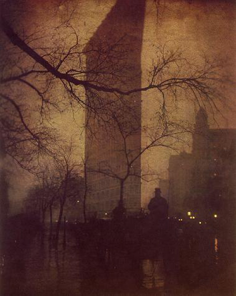 Here is a sepia-toned version of the same photo. I'm not sure if a 1904 print would have looked more like this or more like the greyscaled one just above. Anyone know?
Hmmm. Did I mention I really like this photo?
posted by ThursdayJava @ 1:43 PM
![]()


1 Comments:
At 8:22 AM, Constantine the Hunted said…
It's quite beautiful, non?
The branch gives the whole piece on organic, flowing feel to it. I also like how the streetlights substitute as grounded stars with the implication that the real sparkle is the world we live in and not the sky above.
If you didn't mention the Hansom Cab driver, I wouldn't have seen it upon first glance. The solution to your dilemma is an easy one: let's "Thomas Crown Affair" this photograph for your collection so you no longer have to worry about how washed out a reproduction can be. Seems quite obvious.
Ready, Steady, Go! (no relation).
Post a Comment
<< Home